A Website is a Space Entry 02

In December 2015, Níall McLaughlin Architects and Yeoryia Manolopoulou asked us to design the website for the Irish pavilion at the Venice Biennale 2016, which will attempt to understand and improve the spatial experience of dementia sufferers.
Under the title Losing Myself, we were given a brief to develop an online platform to collect, archive and present the material that would emerge during the architectural design and research process. This material could take the form of text, video and audio files, and was to be divided into the respective categories. The target audience of the website includes architecture professionals; people interested in the topic of dementia in general, and patients affected by dementia themselves. We therefore focused on developing a website equally accessible to users with widely differing abilities and levels of familiarity with the use of computers.
In a peculiar way, working for the Venice Biennale carries an obligation to innovate. In this case, the challenge lay in the tension between a conceptual acknowledgement of the workings of the mind of a dementia sufferer – negotiating the world relying on the sometimes unreliable temporal and spatial fragments available in his or her mind – and facilitating the navigation of the site as easily as possible.
During our design development, we had the chance to meet neuroscientist and dementia specialist Sebastian Crutch from UCL. In the course of our conversation, it became clear that there was no ‘one size fits all’ approach to create a dementia friendly site, as symptoms vary widely. However, we encountered an objective that seemed worth pursuing when enquiring about the social implications that accompany the condition. As the condition progresses, people with dementia may lose the ability to participate in tasks that others in society take for granted. This can lead to frustration, all too often accompanied by an auto-imposed avoidance strategy, resulting from a fear of failure and further intimidation. This can lead people with dementia to retreat from public life and become socially isolated, which further reinforces their fear.

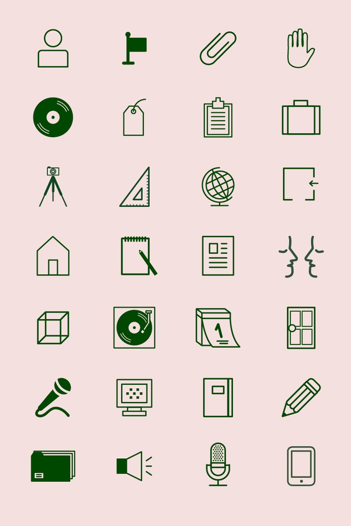
Therefore, the design of this website represents an attempt to create a space where each move or click yields a positive result. We tried to develop a site that maximises ease of use, and minimises the possibility of error. Navigation to the categories is invited via a number of icons that aim to suggest their significance through long-term memory references. For those for whom such categorisation induces the intimidating prospect of failure, we have included a browsing mode: ‘everything’. This displays a random selection of entries with no underlying structure that needs to be grasped. For further accessibility the text is set in a moderately increased font size, and the colour ways provide a slightly lower visual contrast than black on white. In case of clicking on a dead link (Error 404) the user is redirected to the homepage: no error page is displayed.
As such, we hope to provide a space for the design team which allows them to reach the wide variety of their envisaged audience; an ‘error-free’ space that can be navigated both by proficient internet users and by those with dementia, whose changes in perception are so difficult for us to understand.
by Axel Feldmann and Marco Ugolini of objectif.
P.S. This project has not been concluded. We will continue to test the site with dementia sufferers and make improvements during the Biennale and beyond. In the first such test (carried out in February at UCL with one person with dementia and her carer) the only major difficulty the lady encountered was to read out the names of Níall McLaughlin and Yeoryia Manolopoulou. How could you blame her for this?